Monday, March 23, 2015

Typography Images

Typography is the design and use of typefaces as a way of communication. Typefaces are used in typography, and are sets of one or more fonts. Typography is based off of handwritten letterforms. Typography surrounds everything from calligraphy through digital type and type on Web pages. It also includes type designers who create new letterforms as well as designers and calligraphers who use the letters as part of their designs. Typography uses typefaces and the whitespace around and through them to create a whole design. Basically, it is portraiture covered entirely with relatable words over a black background. To make a lasting impact using typography, of course, it has to be beautiful. Besides visual beauty, the words must have a powerful and deep meaning that people are able to read and enjoy. Maybe a poem could be in the portrait or a famous quote. This could create an impact if the passage is deep and touching, or relates to the reader.

For me personally, the hardest part was remembering the steps and following a long with the demos. I would usually get stuck on one step, and miss the next steps because I am trying to figure out the step that I missed. To overcome these challenges/mistakes I would either ask a friend for help, or I would wait for Mr. Sanderl to finish his demo to either help me or do another demonstration. Because I do this often, I have learned to just listen to the instructions completely, until I start working on them. This usually helps me finish quicker and more efficiently, because I do not make mistakes forcing me to restart or make everything more difficult than it would have to be.

For my first example, I took an image of Nikola Tesla off of google images. For this particular image, the words covering his portrait was several paragraphs about him and his life. I got the information off of wikipedia. I personally like this one because it is just black and white making the text more visible. Also, you can see more of the words easier because the text was not a brush, it was pasted on in paragraphs that don't overlap. For my second example, I took the photo of my Science teacher Mrs. Bandsma. Like the first example, I covered her portrait with text however this one was a bit different. For the text in this image, I created a brush of text that I could place anywhere on her face. Because of this, I was able to make the words different sizes. Because of the bright colors, I think that the image pops out more however I feel the words are more challenging to read. My last portrait is the "me" portrait. This image is a portrait of my own face, hence the name "me portrait". I personally like this one best because of the vibrance and colors. I was able to adjust the vibrance of my word sections making the lighter parts lighter and the shadows darker creating a more realistic image. Like the 2nd example, the text was created as a brush, yet the words are much more obvious and easy to read, mainly because of the size and vibrance. Overall I think I made quality work and was successful and satisfied with my final outcome.


Wednesday, February 25, 2015

Double Exposed Portraits

Portrait photography is also known as portraiture. Portraiture is photography of a person or group of people that create the expression, or mood of the photograph. Usually when using portraiture, the focus of the photograph is more often the person's face, although the entire body and the background may be included as well. Profile photography is the shape of a head or face that is seen or drawn from the side. This relates to portrait photography because both photos are of faces and are close up photographs most of the time. Silhouetting is a photograph usually of a dark shape or object up to a lighter background creating the object a dark outline or like a shadow. Silhouetting can be like portraiture, because you can take a Silhouette portrait, which is exactly what it sounds like. It is a silhouette of a portrait, so it is a facial image, but it is very dark, so it is basically just the outline of the face and the rest is black, like a shadow.

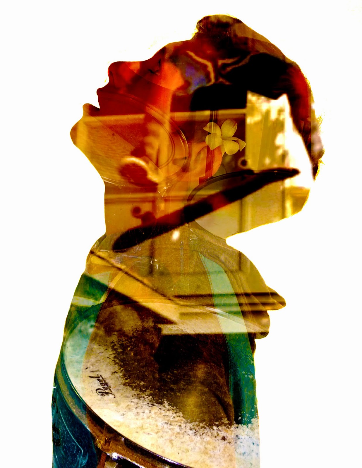
 When creating a double exposure image in photoshop, first you need to take your photos. One photo of you or your friend. Next, you'll need 2 photos of nature, like trees or other plants. Now, I'll explain the process through the following steps. Step 1: Take your images. Step 2: Download them to your computer. Step 3: Open photoshop and click "file". Next, click on "scripts", and then click "load files into stack".  Step 4: Use the "dodge tool" to make the background of the portrait image all one color, usually white. Step 5: Once you have used the dodge tool to create the white background, you double click on one layer to get the "blending options". When you are there, you will go to "blend mode" and change it to "screen". After doing that, all of your photos will combine into one. From there you can move them around, add layer effects and make it as cool, colorful and beautiful as you can. I would want to make a double or multi exposure image because they are very beautiful and express many feelings in different ways. I love making these and looking at them because of all of the colors and designs within the portrait.

The images within my portrait symbolize what I like to do or my hobbies. For my final, or multi exposure image, I took photos of me skateboarding and my drumset. I love to do both of these things so I put them in to represent me. For the practice I had my portrait and two pictures of plants and trees. The left one is my practice and the right one is my final. If I did this project again, I think that I would take different photos. I say this because, although they are good photos, when they blend into my portrait, I think it looks kind of boring. I would like to have more detailed of pictures to cover up the open space of my face. I could have also added and experimented with more effects to make the colors really pop. I used a lot of curve effects, vibrance and saturation to get my outcome. I am satisfied with my work however it could have been a little better.


Monday, January 26, 2015

HDR Photography

HDR photography is a method, where dynamic range is the ratio of light to dark in a photograph. Instead of just taking one photo, HDR photography uses several photos, taken at different exposures. After you have these photos, you combine all of the photos into one photo and it usually makes a photo with a great amount of exposure. It is used to make a photo with exposure that is not too high or too low. I really like using HDR photography because it doesn't put you in the position of having to pic which one of the photos has a better amount exposure because it chooses for you and is usually the perfect amount. I also like being able to edit the photos after combining them to make the photo even better.

To create HDR image, you can take from 3-6 photos from very low exposure to very high exposure. Once you get these photos, you have to upload them to your computer. Next, you open adobe photoshop. When that opens, you click on "file", then "automate", and go to "merge to HDR pro". After that you hit "browse", find the photos in a folder, click "ok" and photoshop will merge the photos into one. Automatic HDR functions are HDR buttons, on certain cameras, and all you have to do is enable it or just turn it on. When you turn it on, the photo you take will automatically have a good amount of exposure and thats all there is too it. If there is an HDR button, it makes it a lot easier and you don't have to work at all to get a perfectly exposed photo.

My thought process when making an HDR photo is to make the coolest, most colorful and bold photo that makes people say "WOW that's a good photo".  I try and make the photo realistic but still edited to make the colors pop out more. I am so focused and deeply eying the photo making sure I do not enhance it too much or make it look too fake or overly edited. I am usually pretty calm because I enjoy doing it and I'm good so I can take my time. For this particular project I actually tried to make these photos very surreal.


Wednesday, January 14, 2015

Movie Trailer Critique


P1T2 Plane Ride Home from Kapaa Middle School MEDIA on Vimeo.

 This project was to create an entertaining movie trailer that was appropriate for first graders to watch. We created our project on an app called Final Cut Pro. We used all kinds of cool effects to make it as cool, creative, and as good as we could. My teammates were Sophia Rodriguez, Justice Chatfield, Maceo Cantu and I. Our plan document shows our synopsis, teammates, voice acting script, characters, setting, plot and purpose. This will basically show you everything about our story and how we contributed to the story. I personally contributed as one character in a scene, and I helped with some of the editing and foley.

The project required a 1min and a half to 2 min show, five scenes, voice acting, foley, dialogue, text-lay overs, effects, and a movie poster. This definitely sounds like a lot of work but we got it done good and to our surprise it was exactly one minute and thirty seconds. We did complete all of them however some could have been better if we had more time to work on it. I think the overall trailer came out pretty good. It was humorous and had a plot which our audience loved. In fact, our class voted our video number one to show the first graders.

The majority of the classes critique comments were saying how funny it was. They liked our transitions and most of all our settings. Using our editing skills on Final Cut Pro, we added our own backgrounds in the trailer to match our voice over and plot. I agrees with the critique results because it was a very humorous video and I think we did a great job on the editing part. I learned a lot more editing skills during this project and got more comfortable with Final Cut Pro. I think I could make a pretty good video on my own using the things I learned, if I had a subject.

Monday, December 8, 2014

Movie Poster Promo

When you look at my movie poster  you see an airplane. I did not share the characters, but the plane is representing the main idea/setting. Our title is Plain Ride Home because it was going to be a normal plain ride home until bill realizes that he has to do crazy, exciting tasks to get home in time for christmas. Kerning the process of adjusting the spacing between words. I use this to make my presentation dramatic, easier to read, and better looking for the person looking at it.

The effects that I use make my poster pop out so when you look at it, it should make you say "wow, I want to watch this movie trailer". I used bold colors and outline effects so all of my words are booming off the screen. I used colors that are very easy to see. I put the stroke effect on several of the words to make the words pop out even more. I also but the cutout filter on the airplane so that it looks more animated and interesting.

Tuesday, November 18, 2014

Proactive or Procrastination?

To be honest, I am sometimes both proactive and a procrastinator. I say this because sometimes I get lazy and restless and procrastinate, but other times I am very anxious to get my work done and complete it with greatness. Usually, if i enjoy the project I will be very proactive, and try hard to get my work done, and turned in on time. However, if I do not like the project, it is more likely that I will procrastinate. Overall, I think I am more proactive rather than a procrastinator.

I think that my level of productivity relates to my amount of free time, because when I get my work done when I am focused, it does not take long where as when I am getting side-tracked and taking a very long time on my work that I could be getting done quickly. When I finish work with authority and I focus, I am provided with more free time to do fun things. When I procrastinate, I can take up to an hour on assignments that should only take me a half an hour, and that gives me a lot less time to enjoy the rest of my day.I would change my work habits by getting my work done quicker but still focus and get it done right. I will do my best on all subjects and assignments and will not procrastinate.


Thursday, November 6, 2014

My Visual Poem


My poem topic is overeating. I start with explaining how good food makes me very happy. Then, I tell a humorous fiction story about overeating and becoming highly overweight. The B-role that was included is me acting out the story of the little boy that overeats. I think that several audiences would enjoy the visuals because there are some funny actions that I act out.

Although I did not use many special effects, the effect I applied make it more intriguing to the person watching. It makes the watcher want to possibly watch it more than once, and makes it better overall in many ways. I am satisfied with my final results but I do feel that I could have improved it a lot too. I could have done this by adding more effects like music, special fades and other things like that. I am very glad we did this project and would love to do more activities similar to this one.